


Fountain pen ink art


I always find it difficult to answer when anyone asks me where I’m from. The truth is I lived life on the edge as a child. I was born on the edge of Frindsbury, which was on the edge of Strood, which was on the edge of Rochester. As a young child I walked downhill to primary school in the village of Wainscott and, later, caught a couple of buses to my secondary school in Rochester.
The reason I mention all this is because I went back to Rochester last week to meet Nick Stewart, who is a graphic designer and fountain pen ink artist. It was fascinating seeing him at work and hearing him explain his working method. So, inspired, I went home and had a go myself. At the top of the page you can see one of my pictures, created after watching one of Nick’s short tutorials. All those lovely colours come from just one ink: Diamine’s Amazing Amethyst.
More significantly, here is a picture created by a nine-year-old with Special Needs. I guided her through the process but it’s all her work.
The wonder of using fountain pen ink is that you can create some amazing effects with just one ink in a matter of minutes. To see how this works, look at the examples below.
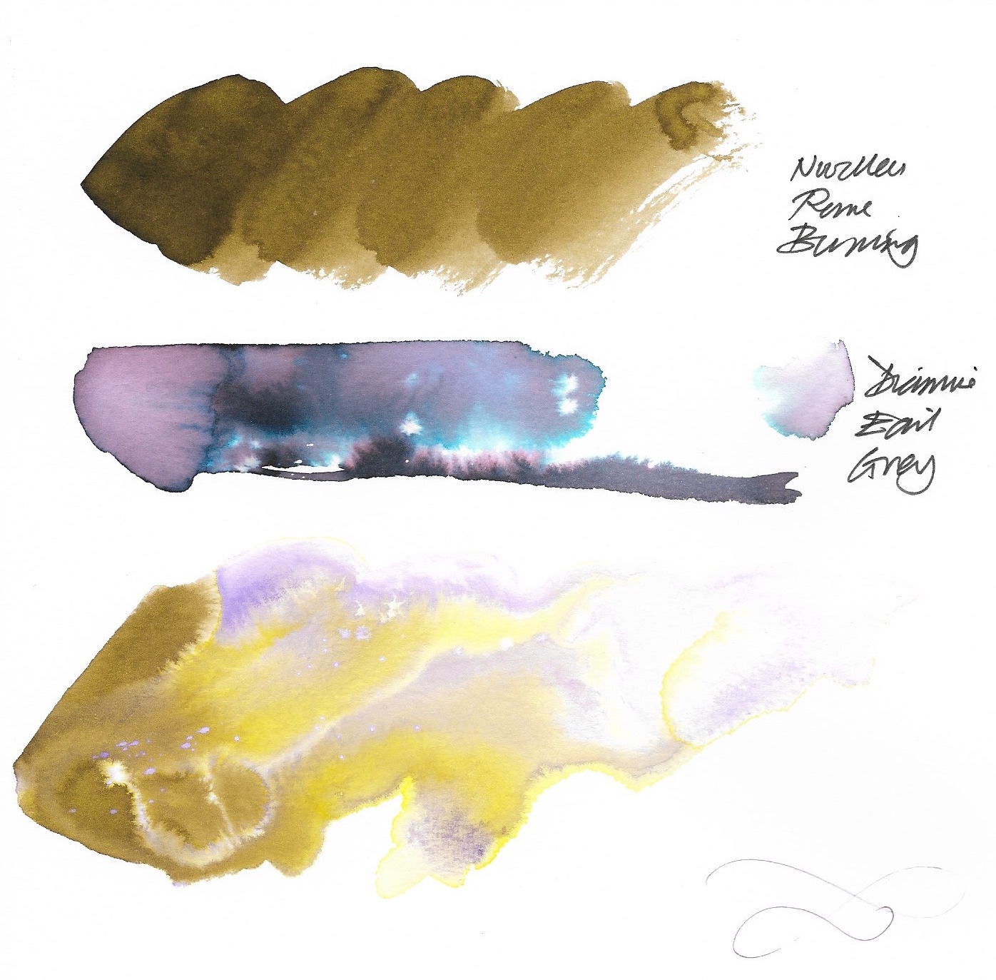
The first swirl is ink painted straight onto paper, but the third swirl is the same type of ink painted onto paper that has been wetted first. You can see how the relatively dull colour breaks down into some glorious yellows and purples. The second swirl is Diamine Earl Grey ink painted onto wetted paper. You can see a landscape emerging quite by chance. For more examples, see Nick Stewart’s website.
So what do you need to try fountain pen ink yourself? The answer is not a lot, which is another reason to recommend this approach. To get started, I used:
Two or three brushes - a size 24 brush is good for applying the initial wash of water
A fountain pen (though this isn’t strictly necessary) - I use a Kaweco Student pen, which I really enjoy writing with
Some fountain pen ink (this is necessary!)
A jar of water
Watercolour paper
Kitchen roll to remove excess ink or water

I’ve started experimenting with different inks, including old cartridges and Parker ink from school days, but they’ve not really worked too well. Fortunately, Diamine produces some really lovely inks, though I was slightly disappointed that my Diamine Claret didn’t produce a range of colours. It just stayed claret. As I mentioned above, Diamine Amazing Amethyst works really well and is also a lovely colour to write with. You can find a lot of specific ink recommendations on Nick Stewart’s website.
Experimentation is important. You get very different pictures by applying different amounts of water and by adding the ink in different ways. You can just swoosh a line of ink across the top of the wetted page and let it work its way down. Or you can add small drops of ink to wetted areas to create the tree effects. Or you can add ink and then slightly agitate the page to help it flow in the desired direction, though I’ve learned very quickly that it usually works best when I leave the ink and water to their own devices.
However, there are some things I can control. The 2/3, 1/3 composition rule works well, for instance. So in the picture at the top of the page, I’ve got 2/3 sky and 1/3 foreground, while also keeping the foreground detail in the first third of the page, looking horizontally.
One last point to make: you don’t have to apply water to the whole page. Leaving a gap a third of the way up the page enables you to draw in details with pen or brush (such as the fence, people and dog in the second picture.)
One of my most treasured early memories at Wainscott County Primary School was drawing a picture of a race and my teacher telling me that I’d be an artist one day. I was five years old and it’s been pretty much downhill since then, but now, several decades later, I can almost dare to hope that I’m on an upslope at last. I’ve certainly got a great deal more to learn, but it’s been a lot of fun so far.